I started designing the pieces around my sitemap. We both agreed that using the school colors of red and black would compliment the site nicely, so we went with that. The typeface I chose is Arial / Helvetica because it's very similiar to the school's logo.
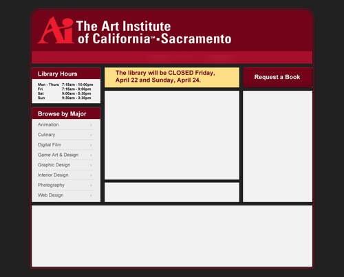
The library hours needed to be at the top, because the most important information needs to not only be above the fold, but in a place where people are most likely to look. The main content was going to be placed into the middle, just below the updates container - highlighted above in yellow - which would be scrolling with information and allow users to browse through them, too.
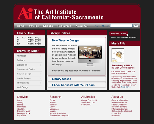
The navigation along with the search bar. The search redirects users to a different site owned by the Art Institue Library that helped its users locate books' availability and options for checkout.
The content under Library Updates is an accordian style jQuery plugin that pushes old content down and keeps the newest posts at the top. Also added the button for the Request a Book form for users and gave users a place to view the featured books of the month, while giving them a link to read more.
Meeting with my client, we discovered a few problems from the first draft:
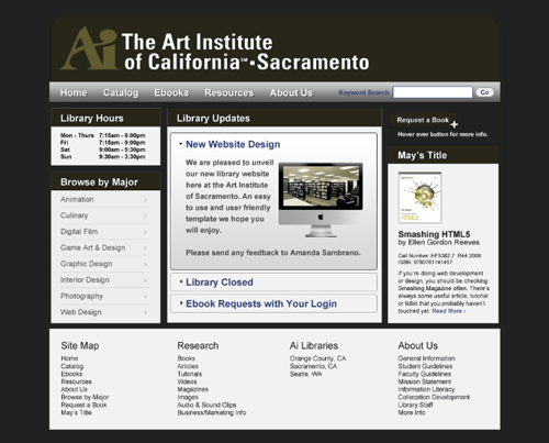
The above image shows what a color-blind user will see. Even with the black and white contrast, the links are almost hard to spot and there is no hierarchy. I wanted to get the hierarchy working first before I solved the color scheme problem.
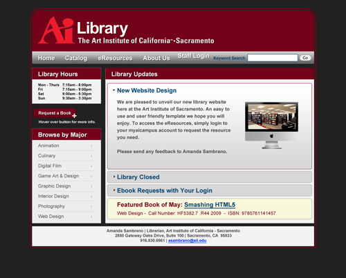
Allowing a lot more breathing room for the main content, the site is looking better. The featured book leaves much to be desired as I have not figured out how it should look to its users. I completely threw the idea out about the sitemap since the navigation is more than enough to take care of accessing the site easiy. Instead, I placed contact information for the users to get a hold of my client.
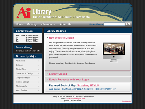
Next the color scheme. I came across a good tip off a friend that Facebook's color scheme is mostly blue because Mark Zuckerburg is color blind. Playing off that, I made the supporting elements blue and the links a light pink color, not red or blue. For now, the yellowish color at the top would remain as I continued to play with the color schemes.
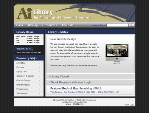
Color blind mode is active and links are visible as light greys while the supporting elements recede into the dark background.